
Final Cut from Jake Clements on Vimeo.
Tuesday, 30 March 2010
Music video: Final Cut
The final touches are now being added to the video, and hopefully if there are no problems with the size of the file we will be able to get it posted onto Vimeo and uploaded tonight. Once we have done this it will allow us to evaluate our project much further as well as receive more feedback.
Sunday, 28 March 2010
Music video: Rough cut
After completing the rough cut of the video a few days ago we tried to upload it so that we could post it on our blogs, and hopefully get some feedback, however this was not the case. Both Jake and I put the rough cut onto memory sticks in order to upload them at home, as we were unable to upload at school. We found the same problem - The size of the video was approximately 510 Mgb, and the maximum size video that we were allowed to upload was 500 Mgb. I did not have any software on my home computer that would allow me to slightly reduce the size of the file, however Jake did, and he was able to upload the video to Vimeo earlier today. As we had missed out on possible 3 or 4 days of feedback we decided to take feedback from other media students during lesson time. Their thoughts, along with pros and cons of the video were recorded on paper, and taken into account whilst the final cut of the video was still being made.
I'm worried that the size of the finished product will be too high as it was 510 mgb before things such as cuts and image effects were added.
Rough Cut from Jake Clements on Vimeo.
I'm worried that the size of the finished product will be too high as it was 510 mgb before things such as cuts and image effects were added.
Ancillary Task: Magazine Advert
Whilst i have been working on the four faces of the Digipak, Jake, Jacob and Alex have each been working on separate magazine adverts. Each of them making something completely different to the other's.
Firstly there is Jacob's - Rather than going with the house theme that has been set in the video and Digipak, Jacob decided to use the existing Album cover, and he played about with fonts and layouts. Although it wasn't following the house style, he has managed to create a possible layout for the magazine advert.

Jake, on the other hand, decided to take the photograph that we were originally going to use on the digipak - (the image of a motorway at night, with the car lights blurred.) He found a number of fonts and picture effects and his final piece was a good step towards completing the magazine advert.

After taking the raw image and adding the same image effects that i had used on the digipak, take then found and added some of the text.

I suggested to Jake that he should add some effects to the text, as it was looking slightly flat. He did so, and the end product was this:

Whilst Jake and Jacob were working on theirs Alex had also been doing his own advert.
He used the house style that i had created in the digipak, taking the font that i used on the front and back cover [Before i had changed it], and the colour effects that i had added to the images. His final product was very strong, and as a group we decided to use his final piece.

Feedback from our teacher made us look for a different font to use, as the one in the picture above was too decorative that it would have taken away from the final product. I found a font very similar to one of the fonts i had seen used on some Foo Fighters products, and used this in both the digipak and the final magazine advert.

Target Audience
The work and research done on target audience should really have been posted prior to the completion of some of the pieces however, it is still extremely useful to look at the audience and recieve feedback in order to know what could be improved on the project so far.
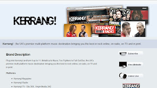
Foo Fighters are a vastly popular alternative rock group. Their fanbase is extremely wide and therefore pinpointing one or two demographics of the audience would be near impossible. Jacob has done some research into which magazines have articles about them, and how often they appear on the front covers of popular magazines.
He found out that they have appeared on the front cover of Kerrang! 27 times. Information like this can be used to start defining the target audience. The readership of Kerrang! has changed over the years, mainly reaching out to ages between 14 and 26. Although this is just one magazine, and wouldnt give a complete idea of our target audience it is a starting point. The age group is fairly young, and you can draw some conclusions from this. For example, as the age group is this young it is likely that they are not on a high income, but as the magazine Kerrang! is quite a respected magazine in the industry, they may have some form of income, even if it is not high.
Ancillary Task: Digipak - All four faces
I have now finished working on the digipak. After constructing all four of the faces i tried to find away to superimpose the faces of my digipak onto a blank template. I tried using Free Transform on PhotoShop but was unsuccsessful in my attempts to stretch my image over the template.

After not being able to do this, i gave my images to Jake on a USB stick. He took them home and researched how to do the process. After finding it out he took my images and managed to impose them onto the template. Here below are the finished pieces.


And here are the four faces laid out.


After not being able to do this, i gave my images to Jake on a USB stick. He took them home and researched how to do the process. After finding it out he took my images and managed to impose them onto the template. Here below are the finished pieces.


And here are the four faces laid out.

Ancillary Task: Digipak - Inside Sleeves 2
For the inside sleeve of the digipak i decided to use one of the very first pictures i took - Of the lead singer, singing into the mic, whilst holding his arms out. Like the other faces of the digipak i added the same black and white with a red filter over the top.

[Add Image] - (Erased firebell/Light)


[Add Image] - (Erased firebell/Light)

Ancillary Task: Digipak - Inside Stages
There were only a few simple stages that i took when creating both of the inside faces of the digipak. I went through all of the photos that i took on all 5 or 6 days of filming in an attempt to find some good quality pictures which werent too blurry. There were several of the 'Band' as a whole. but i thought that as they had been seen as a whole on the front cover as well as the back, i decided to use something different. I had taken a number of photos whilst we were setting up on the days which we filmed. Including the one which i used for the inside face which holds the CD

I decided to cut out the microphone from the picture using the lasso tool on PhotoShop. I then stretched what was left of the original image giving a blurry effect on the background whilst the microphone was still very clear.
[Add Photo] - Stage Two (Lasso'd Microphone on blurred background)


I decided to cut out the microphone from the picture using the lasso tool on PhotoShop. I then stretched what was left of the original image giving a blurry effect on the background whilst the microphone was still very clear.
[Add Photo] - Stage Two (Lasso'd Microphone on blurred background)

Ancillary Task: Digipak - Inside Sleeves
For the two inside faces of the digipak i wanted to keep the same colour scheme and overall style to whatever picture i would use. I have looked at a number of other digipaks and have noticed that the inside covers tend to be without any text on them, but instead just pictures. The album that i looked at especially 'Start Something' by Lostprophets shows that the same picture effects have been used for each face of the digipak.


Thursday, 25 March 2010
Ancillary Task: Magazine Advert
Jake has been working on the Ancillary magazine advert. I had to finish the Digipak front cover before he could continue with the magazine advert.
Jacob found and scanned a number of magazine adverts that we thought would be useful to take into account and analyse prior to the designing of ours.


There are conventions that bands follow in all of their print work. The house style that they create include things such as font styles, band logos and colour schemes. Foo Fighters' logo is used on a lot of their work. This is so that their albums are easily recogniseable to fans that have already bought previous work from the band.
Digipak: Back Cover
Below is the finished back cover of the digipak. I have been looking at layouts of digipaks of bands with similar genres and tried to use some of the features that are in their digipaks. I also carefully read what legal information had to be put on the back as small print and i edited it so that it was relevant to the music group that produce and distribute Foo Fighters products.


Digipak Stages: 2
I have been working on the back cover of the digipak, i have followed the house style that i created on the front cover by using similar fonts and colour scheme.


Tuesday, 23 March 2010
Video Analysis: One
Here is the first music video that i have chosen to analyse. It is 'The Pretender' by Foo Fighters, and it was directed by Sam Brown.
The genre of music performed by Foo Fighters is alternative rock. Alternative rock is a style of music that has risen in popularity since the 1980's. Commercial success has been had by bands such as R.E.M and Nirvana.
The characteristics presented by this music genre is generally groups that have been rejected by commercialism and mainstream groups however this has changed greatly as it has become an extremely popular genre of music.
Alternative rock music videos have a sort of house style, despite it being such a wide genre. The majority of the videos show a live performance, with some of them adding a narrative into them that relates to the lyrics and overall theme of the song.
There are a vast number of shots used from all sorts of angles and distances, with a lot of focus on the lead singer.They tend to use a large amount of close up shots emphasising the emotion in the lyrics and music.


The relationship between video and lyrics aids in defining the genre which is being presented. As you can see from 'The pretender' The correlation between the two isnt terribly visible until around three minutes into the song, and even then the shots show a great emphasis on band performance. This is what we intended to recreate in our music video - A strong emphasis on performance.
Digipak: Stages
Here are the stages of development for the front page of the digipak.

For this stage I found the dimensions of a standard 4-sided Digipak (138x138mm) And drew a coloured box, and added a bevel/emboss texture to give it a rough look.

I added a photo that i took on set of one of the filming sessions. the reason it is dark is that i changed the opacity for the next stage as i was added another picture over the top of it.


On these two stages i added the second photo. This was taken at a later stage, and i had to use the lasso tool around the guitar to remove it from its original background. an outer glow was added to the guitar as on its own it would have looked flat. Due to this i also embossed the edges giving the effect that it is not flat.

I found this font at Dafont.com along with a selection of others, i made a list of them and asked people for feedback on which they preferred.


On these final stages i added a sticker like shape onto the bottom corner of the digipak. This is because i felt that the image was looking rather plain. Digipaks tend to have some information about things such as who the album features, bonus tracks, tracks released as singles Etc.
Digipak: So Far
I have been working on the digipak recently and have designed the front cover for an album, this gives me a good starting point for the rest of the digipak, i can now work on keeping the house style through the rest of the digipak.

In my next post i shall show my stages of development and explain some of the effects that I used as well as why I did what I did

In my next post i shall show my stages of development and explain some of the effects that I used as well as why I did what I did
Tuesday, 16 March 2010
After school
Jake and I will be staying behind tonight after school for a couple of hours in order to try and finish our editing so that we can post it.
A bit later on we will also be taking photos for the ancillary task, and will hopefully be able to start editing our digipak on PhotoShop.
There is currently around 20 seconds of footage left to edit and then some transitions to add, other than that we are pretty much finished with the music video. The time left that we have to do the ancillary tasks is very little so we will have to work quickly on the editing of the digipak and the magazine advert.
Monday, 15 March 2010
Evaluation Question: 4
How did you use new media technologies in the construction and research,
planning and evaluation stages?
As it is a media studies course, a high percentage of the work that we did was done using computer programmes, some of which were fairly new to us. Despite this, we practiced on the programmes we had not used previously, and tuned our skills on the ones we had.
The use of a blog to document a years worth of media work was a daunting new experience. None of our group had much previous knowledge of blogs, and at first it was quite difficult to get used to constantly documenting what work was being done. The layout of blogger is fairly simple, and after a while of using it, it becomes a lot easier to navigate.
The first stages of the project were the research and planning stages. For most of this our information such as media packs and statistics were found on various websites. The use of the internet rather than things such as published documents has its pros and cons. On the one hand it is a fast and extremely acessible medium. It is a lot quicker to search an article on BBC news than to buy a newspaper and search for it, so naturally it was fairly simple to find research about target audience and tips on things such as film editing and photo editing. However, physically buying a magazine allowed us to search for things such as magazine adverts for bands, which is something they tend to leave out on the online equivilent of the magazines.
Researching layouts and designs of digipaks was also made easy by the fact that i had so many to hand, on the internet it was hard to find a cover with the criteria i was looking for.
Other than getting magazine adverts and studying digipaks, the whole of the research section was done using information from various internet websites.
Planning, on the other hand was recorded mainly on pen and paper before being scanned in and uploaded onto blogger. For example - the animatics for the music video were hand drawn before being scanned and created into a video file using final cut express. The majority of planning work including things such as short listing songs, drawing storyboards, picking camera angles, organising filming sessions and booking of locations so that we could film there.
Doing the planning section by hand proved to be a good plan, as when the whole group is using a separate computer the comminucation between group members can drop, and it was important that everyone got their suggestions and points across so that we could give eachother feedback.
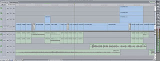
In my two previous years of media studies the course work that we took part in was more print based media, and therefore required the use of programmes such as Adobe PhotoShop, InDesign and DreamWeaver for those who were creating a website. This year we not only had to use the mentioned programmes but also Final Cut Express, a professional video editing programme. The software has a large amount of features, taking quite a while to learn. We needed to understand how to edit correctly, upload videos safely, and how to manage a timeline efficiently. At the start of the editing process our timeline had a lot of unused footage and audio on it. It became quite hard to know what footage was being used and what was not, untill we developed the video further. The audio tracks (Green bars below) were full, as we hadnt removed the original audio from our raw footage. before continuing we had to remove a lot of the audio, as it was taking up a lot of file space. This was one of the reasons our original rough cut would not upload onto blogger - The file size was too high.
Filming was also a fairly new technology to me, in the sense that i had only really filmed one small project last year. However building on this i was able to learn about properly framing a shot using a video camera, as well as only taking footage that is needed and not wasting tape.
The construction of the digipak and magazine advert was fairly easy, as we had all had a lot of previous experience with photoshop. Photoshop enabled us to create, design and produce higher quality print work than other programmes would, and i feel that with out prior experience, it was simple to get back into the hang of using. I would liked to have had more time using it as i feel that the digipak and advert had room for improvement.
The evaluation stage of last years project was simply to make a powerpoint presentation and type up our evaluation on there, this year it is maily text based and posted in the form of a blog. Noticing that some had done things such as an audio interview with an acompanying script i tried to do something similar, as it shows a higher level of knowledge of ICT, however problems with my Laptop microphone and mobile phone upload cable prevented me from uploading the two minute script that i had written for the previous evaluation question, instead i have gone through the work i have done this year finding screen grabs of useful things such as final cut timelines, photoshop tools, and photos of the previous film sessions. As i have an interest in photography i tried to make this come across in the project by taking photos of anything i thought relevant. This proved helpful as a lot of those photos came into use in the project such as the ancillary digipak.

Overall i feel that i have developed my skills on Adobe Photoshop as well as learning some techniques to editing and filming using Final Cut Express
planning and evaluation stages?
As it is a media studies course, a high percentage of the work that we did was done using computer programmes, some of which were fairly new to us. Despite this, we practiced on the programmes we had not used previously, and tuned our skills on the ones we had.
The use of a blog to document a years worth of media work was a daunting new experience. None of our group had much previous knowledge of blogs, and at first it was quite difficult to get used to constantly documenting what work was being done. The layout of blogger is fairly simple, and after a while of using it, it becomes a lot easier to navigate.

The first stages of the project were the research and planning stages. For most of this our information such as media packs and statistics were found on various websites. The use of the internet rather than things such as published documents has its pros and cons. On the one hand it is a fast and extremely acessible medium. It is a lot quicker to search an article on BBC news than to buy a newspaper and search for it, so naturally it was fairly simple to find research about target audience and tips on things such as film editing and photo editing. However, physically buying a magazine allowed us to search for things such as magazine adverts for bands, which is something they tend to leave out on the online equivilent of the magazines.
Researching layouts and designs of digipaks was also made easy by the fact that i had so many to hand, on the internet it was hard to find a cover with the criteria i was looking for.

Other than getting magazine adverts and studying digipaks, the whole of the research section was done using information from various internet websites.
Planning, on the other hand was recorded mainly on pen and paper before being scanned in and uploaded onto blogger. For example - the animatics for the music video were hand drawn before being scanned and created into a video file using final cut express. The majority of planning work including things such as short listing songs, drawing storyboards, picking camera angles, organising filming sessions and booking of locations so that we could film there.
Doing the planning section by hand proved to be a good plan, as when the whole group is using a separate computer the comminucation between group members can drop, and it was important that everyone got their suggestions and points across so that we could give eachother feedback.
In my two previous years of media studies the course work that we took part in was more print based media, and therefore required the use of programmes such as Adobe PhotoShop, InDesign and DreamWeaver for those who were creating a website. This year we not only had to use the mentioned programmes but also Final Cut Express, a professional video editing programme. The software has a large amount of features, taking quite a while to learn. We needed to understand how to edit correctly, upload videos safely, and how to manage a timeline efficiently. At the start of the editing process our timeline had a lot of unused footage and audio on it. It became quite hard to know what footage was being used and what was not, untill we developed the video further. The audio tracks (Green bars below) were full, as we hadnt removed the original audio from our raw footage. before continuing we had to remove a lot of the audio, as it was taking up a lot of file space. This was one of the reasons our original rough cut would not upload onto blogger - The file size was too high.

Filming was also a fairly new technology to me, in the sense that i had only really filmed one small project last year. However building on this i was able to learn about properly framing a shot using a video camera, as well as only taking footage that is needed and not wasting tape.
The construction of the digipak and magazine advert was fairly easy, as we had all had a lot of previous experience with photoshop. Photoshop enabled us to create, design and produce higher quality print work than other programmes would, and i feel that with out prior experience, it was simple to get back into the hang of using. I would liked to have had more time using it as i feel that the digipak and advert had room for improvement.
The evaluation stage of last years project was simply to make a powerpoint presentation and type up our evaluation on there, this year it is maily text based and posted in the form of a blog. Noticing that some had done things such as an audio interview with an acompanying script i tried to do something similar, as it shows a higher level of knowledge of ICT, however problems with my Laptop microphone and mobile phone upload cable prevented me from uploading the two minute script that i had written for the previous evaluation question, instead i have gone through the work i have done this year finding screen grabs of useful things such as final cut timelines, photoshop tools, and photos of the previous film sessions. As i have an interest in photography i tried to make this come across in the project by taking photos of anything i thought relevant. This proved helpful as a lot of those photos came into use in the project such as the ancillary digipak.

Overall i feel that i have developed my skills on Adobe Photoshop as well as learning some techniques to editing and filming using Final Cut Express
Evaluation Question: 3
What have you learned from your audience feedback?
After finishing the rough cut of the footage we decided to get feedback from a number of people so that they could give their opinions on the music video as a whole. We asked the viewers to write down any hints and tips, as well as constructive criticism that they thought could improve the quality of our music video.
We sat a handful of people down one after the other to watch the video and write down any observations, such as overused angles, shots or camera movements. As well as righting down their criticisms we asked them to specify what shots they thought were effective, and generally what they liked about the style of the video.
After they had watched the video, the feedback that was recorded on paper was read and we began to work on improving the video where necessary.


The general feedback from people was positive, however there were some things that came up in the majority of people's feedback. Such as some shots being too long, or the overuse of some of the more obscure camera angles. The feedback suggested that either cutting down the longer shots or just adding something in between them to break them down.


Also, it was said on a couple of occasions that some of the shots we used were too obscure, and they just felt that they needed to see the band from a level view a few more times. I can understand this as for a large segment of the rough cut video was a low angle shot, and it was unecessary to have the band shot at this angle for too long.

After this point we found the editing much quicker, as we knew exactly what to change and what to keep in terms of footage. As well as using feedback we viewed existing A2 media music videos to see if they had any visual effects added onto the video. The majority had, so we decided to add a stronger contrast to the video rather than just using the raw footage. Also, some original footage was too dark, and therefore needed to either be taken out, or have the brightness increased.
These two short clips show how dark the lighting was on some of the raw footage. The powerful lights that we used, cast strong shadows, and it was important to avoid this.
As for the ancillary tasks we did not gather feedback on the same scale as the primary task. We asked one or two people their opinions on font styles, sizes and layout and the overall feeling was that we needed to find a font that could be used across all of the products that could be easily identified and linked to a Foo Fighters product.
We were able to do this fairly easily, and other than that that there was not much that needed changing.
Evaluation Question: 2
How effective is the combination of your main product and ancillary texts?
As we had to create three original products we took it as an opportunity to create our own house style to be reflected across the board. The filming was our first priority, so whilst we were doing this i took the chance to take some photos of the band members during filming and during setup. This proved helpful as i was able to take a handful of usable images which were perfect for the digipak.
I found taking the photos in the same setting as the music video effective as the lighting would have the same intensity as in the video, and also, it was often difficult to get the band together for five sessions of filming, let alone a photo shoot.


Also i decided to use the image of Dan's (Lead vocals/Rhythm guitar) guitar. The reason behind this is that a musician can often be identified by something like a signature item of clothing or an instrument. Slash (Ex-Guns N' Roses guitarist) is a prime example of this with his signature guitar and top hat. It added something to the band which the fan base can recognise - so i felt using this idea could develop into something iconic.

The fonts used over the two ancillary projects was very similar to a font used by Foo Fighters on a number of their products, we felt that using that font would be ideal, as we were not able to use the existing Foo Fighters logo. Being able to use a font not too dissimilar to an existing Foo Fighters font would enable a fan base to recognise their merchandise. The guitar is also the first shot used in the video, and i felt it would be effective to have it visible somewhere in the digipak, as it could become that recognisable icon that gets linked to the band.
Two of the images which i used on the digipak show the band as a whole, the way this was used was to create a direct link between the music video and the digipak.
Alex's work on the magazine advert was strong despite him not having access to my digipak when he started designing his. The colour and font style used in both the digipak and the advert are very similar. On the images in the digipak I first added a black and white filter over them, before boosting the contrast and intensity in Photoshop, After this i changed the hue and saturation so that the images had a red tint to them.


The red/black colour scheme was used across all three products fairly effectively, maybe more so on the ancillary tasks than the primary task. Although the contrast and brightness was changed in the video, adding a red tint to some or all of the shots would not have looked professional. I think it could have been effective if the colour scheme was incorporated into the video, as i feel as if it is slightly lacking the link between ancillary and primary tasks.
As a whole i think the combination of all three products is fairly effective. The digipak and Magazine advert are the strong points when it comes to displaying the three as some sort of brand, i think there is more that we could have done to make the video more relevant to the two ancillary tasks, however I am pleased with the outcome of the video and wouldnt want to overuse the colour themes.
Here are links to each of the final pieces.
Subscribe to:
Posts (Atom)